
Interview with Brighton based artist Kat Carter
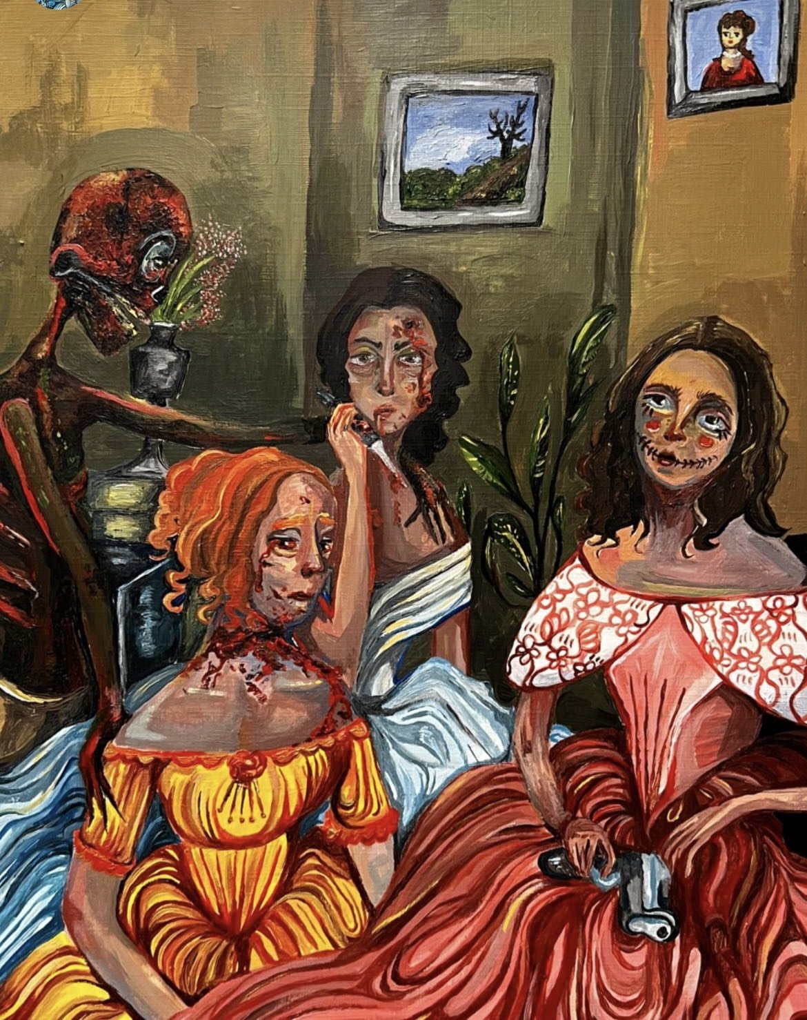
After moving to Brighton from her home town to pursue music, Kat is now following her passion for art with the aspiration to be a tattoo artist.Her work varies between oil paintings and acrylic to line work sketches. She draws a lot of her inspiration from victorian and historical paintings, taking particular interest in realism. Combining aspects of both Expressionism and realism, with hints of neo-gothic. She likes to create contrast in her imagery; "like elegant women in floaty dresses with death and morbid undertones". Much of kat's own aesthetic is based around that neo-gothic victorian vibe, often wearing waistcoats and lace dresses with bold cross jewellery.
A lot of her idea's are also drawn from music, tv and film, influences such asDisney films and nostalgic kids tv programs, artists include Courtney Love and Julia Jacklin.
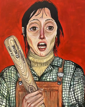
Kat had immersed herself into Brighton's culture, constantly being inspired by the art, people and attractions. She says “I love the atmosphere. I love that everyone is out here trying to explore there creativity in so many different ways. It feels as though it's the last place where people can still be kids again and just be happy making what's inside their heads". This youthful feeling is definitely one that resonates with a lot of people who live here in Brighton, it feels easy to be ourselves and have fun.
She continue to say that because of the art scene and all the creatives, it is easy to flourish and explore your own art; "Brighton has one-hundred percent helped. There's so many people out here that help with your own creative mind. Even the graffiti on the side of the shops helps to keep the creative juices flowing".
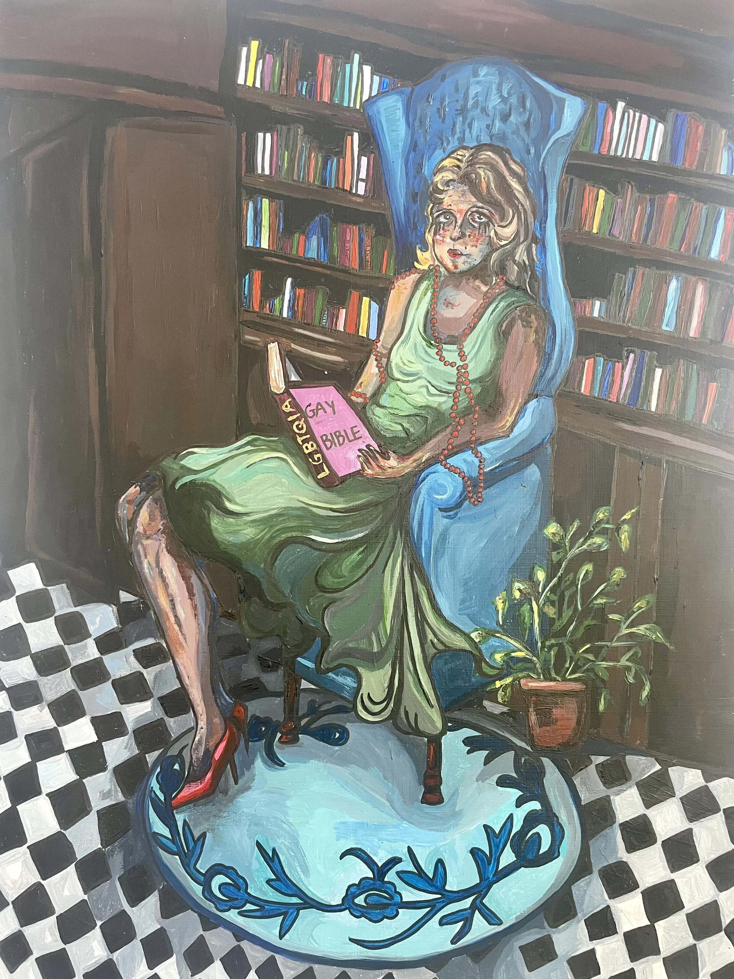
I asked Kat back in June to paint the front cover for Butter and Jam, as an homage to Pride and Brighton's acceptance of the lgbtq+ community.I told her just to do what ever she wanted and I was completely blown away by what she produced and the creativity and thought put into it. A lot of the details are displayed the books.The colour ways being a few of the different pride flags, such as the light blue, pink and white being the Trans flag, pink, yellow and blue being the pansexual flag etc... The woman on the chair also reading a book titled ' Gay Bible'.
The Pearls, the swooshy dress and the bright makeup give an allsuion to a 1920's flapper girl. This ecentric narrative reminds me of all the different styles and aesthetics in Brighton.
Written By Rosie Bollins